Myra Greene: Character Recognition
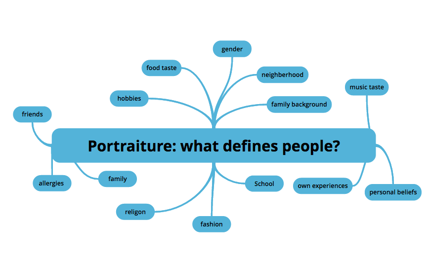
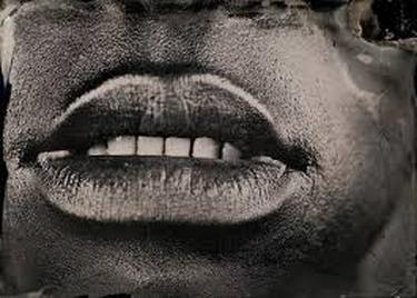
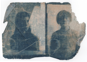
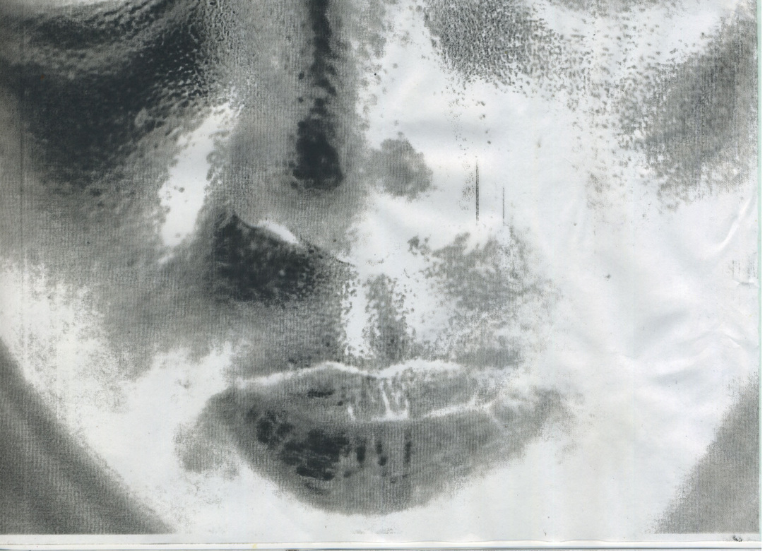
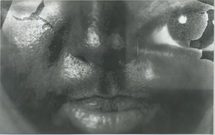
Myra Greene started creating these images after the hurricane Katrina hit in the summer of 2005. She was upset after reading the racist comment replying to articles from the New York Times. Since no one was monitoring the comments they were judgmental and racist. She first thought of doing these sort of images when a friends of hers took a picture of her and she said she looked like a slave. This is what truly made her think of the idea for the project. Greene focused on the first features that a person sees and how they can judge a person without even knowing anything about them. Here she thought about how people could think she was from a slave background. Greene took an interesting process paths she started to make the images by wet plate printing used in the 1850s/1860s. She exposure each image for about 30 seconds on 3 x 4 inches plates. She spent two years mastering the process to make the images. When she is taking the pictures she uses a 2300 watt flash, the camera has to be 9 inches away from her face for the close up to be effective. Her intentions for the project was to question judging character by brief recognition. As this started by her thinking that she had slavery feature she uses technique from the 1860s. Greene used this project to draw attention to science due to people in the late 19th century believing that if you had a slanted nose or large lips they must a criminal and shouldn't be considered a human being. Greene's photo are very raw and making it seem that they come from blackness instead of white.She uses a high contrast to really bring the features she wants.
|
|
My First Response
|
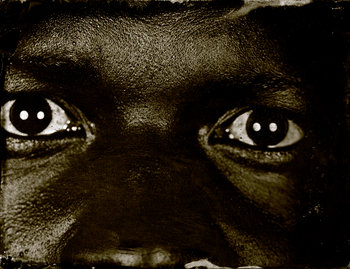
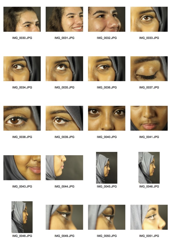
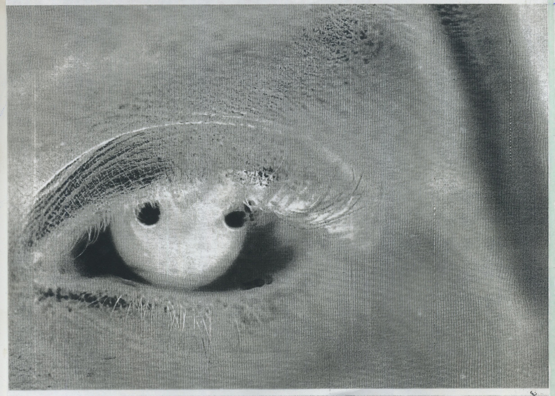
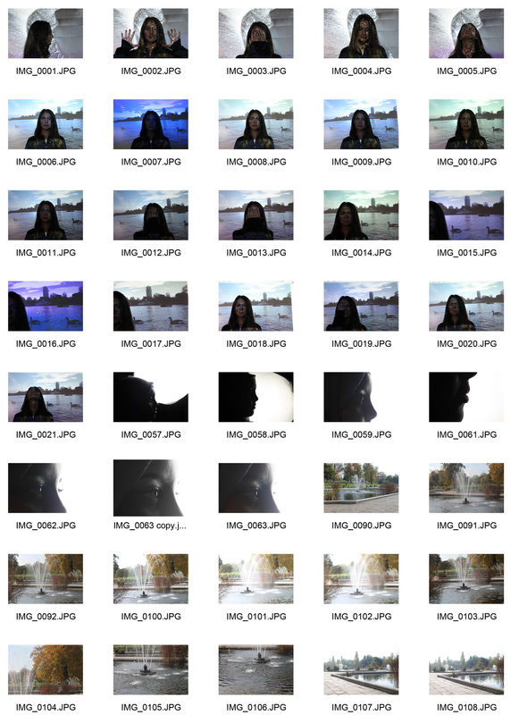
For my first response I asked one of my classmate to take photos of me so I could incorporate Myra Greene idea of ' what do people see when they look at me'. When I was taking photos of the subject I kept asking myself what is the features I first look at; a person eyes. I made my way through the subject face both concentrating on close up of their feature and their whole face. I asked the subject what she likes most about herself and what she is most self consciousness about. Her response, eyes and nose. I mostly focused on these features. When taking the images I made sure I had either the nose or the eye as the thing the viewer first looks at, by putting in the centre of the image. I felt that I was successful in recreating Myra work. I was unable to do the process of wet plating but I used Photoshop. I went on the colour plate and then lowered the colour yellow this made the skin look raw, dry and gave a scale-like texture. One difference that I had from the her work was that I used depths of field. I focus on her eyes or her nose most of the time. I felt that this made it more clear at what I want the view to pay close attention to. However in doing this the skin does not look as raw when it is not in focus.
|
Final Edits |
My Second Response
|
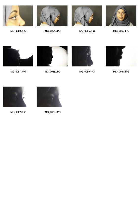
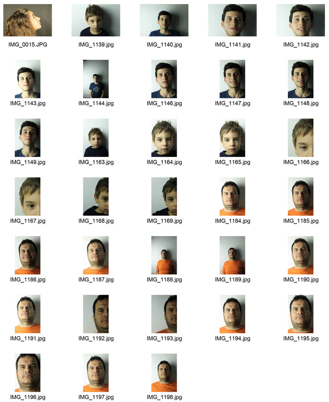
For my second response I took photos of my grandma, mother, auntie and cousin. I used three generation of the family I did this to see what traits were passed down in the family. Again I changed the colour balance to affect the way the subject skin colour looks. I did this to incorporate the idea of judgment of race. My family originally fled from Italy during a civil war and ended up in Brazil. Knowing this history I looked at characteristics that are associated with the Italian nationality, a big nose. I noticed that as the generation went on the smaller their nose got. I used a light coming from the left side to increase the shadows that their noses were making on the other side of their faces.
|
|
Dark Room Techniques
Sayako Sugawara - Cyanotypes
|
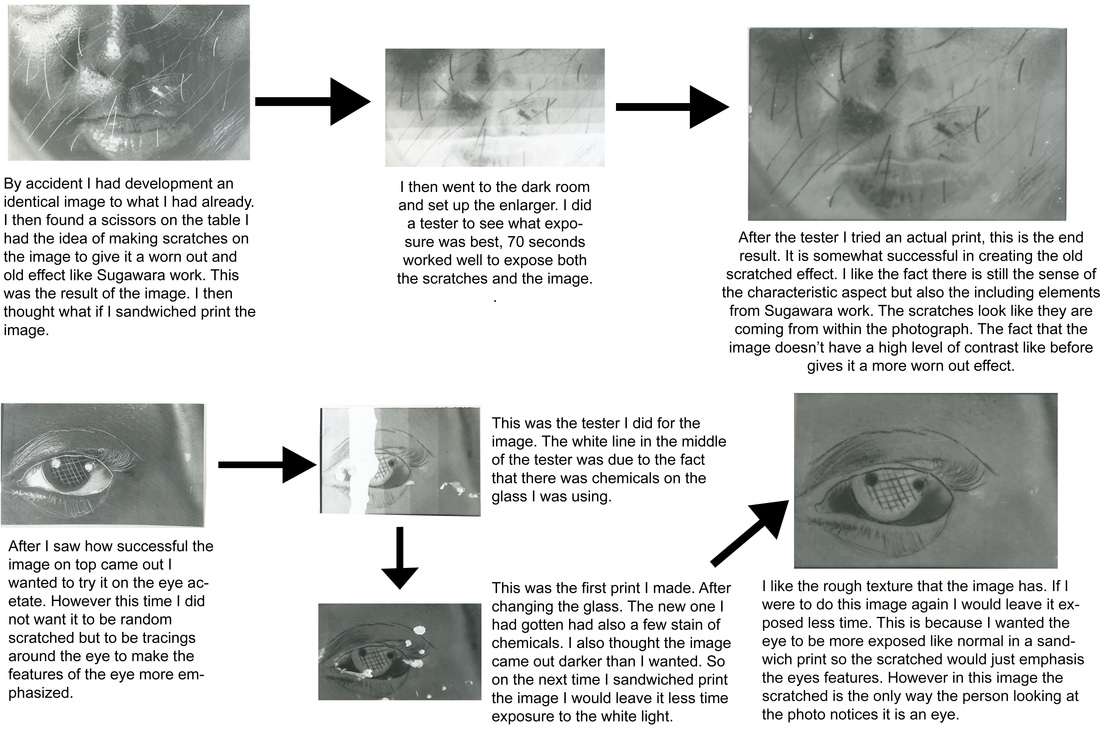
I worked with an artist/ photographer Sayako Sugawara. She was born in Italy but now works in London. She work mostly in the dark room. On friday the 16th of october she came into school and did a workshop with my class. She first showed us her photos and explained the process of how to do them. I wanted to do these images however part of the process included the sun to develop the image but it was not a sunny day.
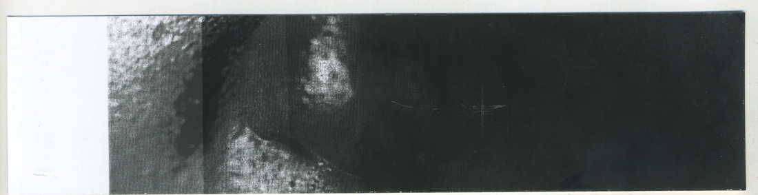
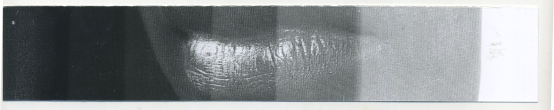
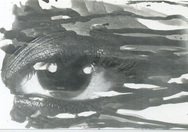
She showed us four differs ways we can develop our images in the dark room: 1. Putting a piece of tissue paper between the light sensitive paper and the enlarger so the image as the tissue papers texture. 2. Using a paint brush to put the developer on the image. 3. Spraying developer on the image. 4. Putting the paper in water with oil in it and then exposing it with the enlarger. These were the two acetate I had to work with. One is of the month and nose, the other is of of an eye.
|
The artist Sugawara took this image of two model. The one on the left is a young girl and on the right is a young boy. She first develops the image normally in the dark room. In this image she poured blue ink on top of the image as it dried. She also fold the paper. this enhances the effect of an old looking photo. since the photo is in black and white the viewer cannot see defining details of the models faces.
tester:
I first have to do testers in order to find the best exposure time for the image. I put the strip under the enlarger and covered a bit of it with black card and then each time I exposure it for 2 seconds and moved the card to reveal more of the strip.
|
|
Method 1
For this method I had to make the exposure longer it was 16 seconds. I did not really like this process as I thought that other than a few bubbles on the images it does not look different from when I develop it normally. If I were to do this experiment again I would find a way to create more bubbles.
|
Method 2
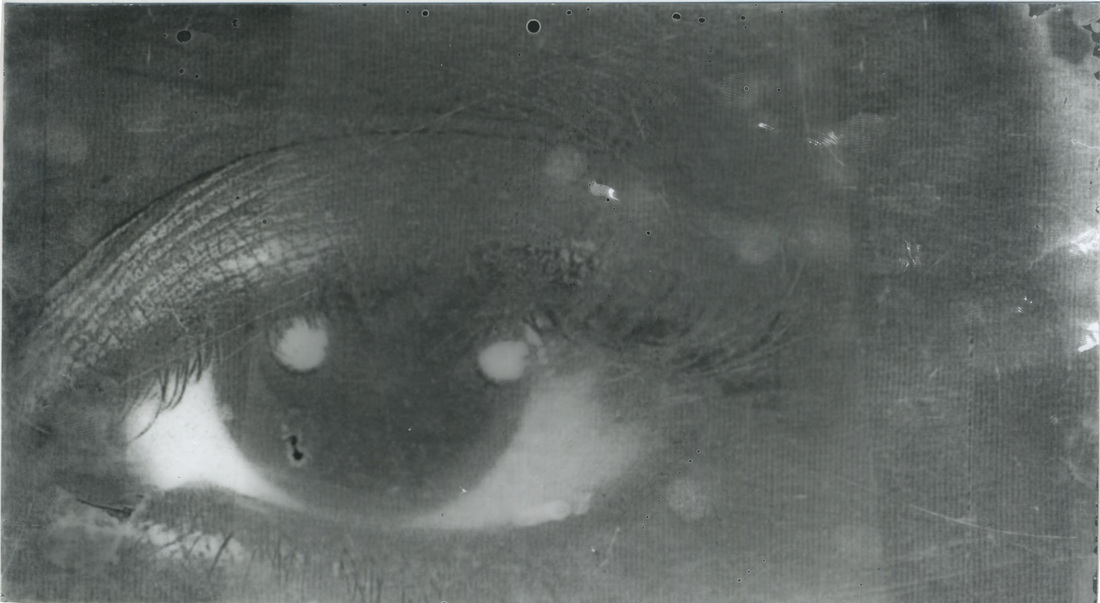
This is one of my favourite development methods. Again I used the eye acetate. It was exposed for about 8 seconds. The thing I like about this development method is that I could control where the developer went on the image and how developed I wanted parts of the image.
|
Method 3
Again with this development method I could control of how dark and develop parts of the image was but I could not control where the developer went with the spray. I like how this images turned out but it is left by chance that the image will actually work. I had to exposed the paper for 8 seconds.
|
Method 4
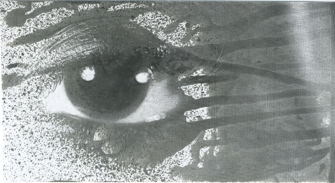
For this image I experimented with putting two acetate on top of each other. I then put tissue paper on top of that to add an unusual texture. What I like about the double exposure with the eye is that it added an interesting twist that not every artist had thought about. However if I were to do this again I would cut the acetate so it would blend more into the other acetate.
|
Lewis Khan: George Town
|
https://vimeo.com/99681489
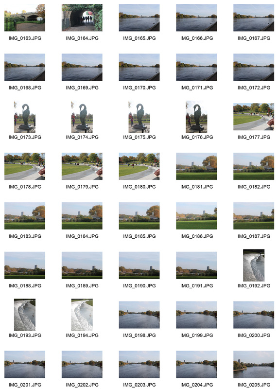
Khans first meet George six years ago. They greeted each other on the streets as they both lived in the same community. Khan chooses to focus on the individual (George) instead of a mass of people. Watching the video it provoked empathy, pity and sadness as Georges life seems empty. This is also emphasised by the repetition suggests that George has a daily routine. Khan does create a structure to the film by having sounds that normally are heard in their community. However as the close up of George’s house starts there is a voice over of George explaining his lifestyle. Khan uses depth of field to create a claustrophobic mood to suggest how isolated George is from the world. The use of extreme closes up; slowly reveal George’s hobbies and living conditions. Khan used low level, natural lighting to make it more about George’s possession rather than a disjointed looked into George’s life. There are a few moments where the sound and visual match for example when George is talking about his mum the words “mums the word” shows up. Khan shows that George has accepted the way he lives at the ending. He puts more light heart music and has full body shots of George along the streets.
|
My Response:
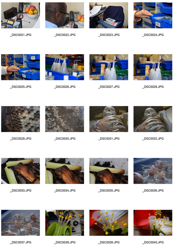
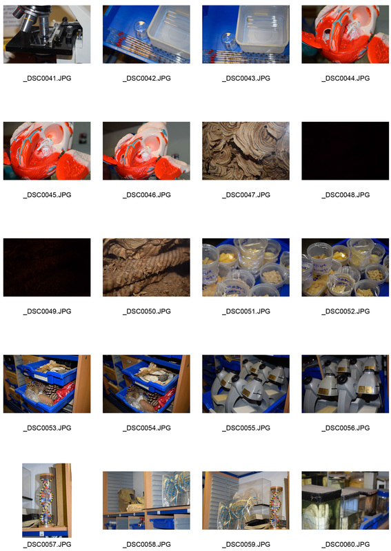
I took images of three different people that work in different areas, a security guard, office worker and scientific technician. Lewis khan work has made me realise how affective close up are. Close up allow me to show the little details about the person belonging and living space. On some of the final edits I did I turned the image into black and white to make sure the viewer would not get distract from all the colours that the image held. Instead I wanted them to look overall at everything there was in the image. However I did keep some of the colours in to make the viewer look at each part of the image instead of viewing it as a whole image. |
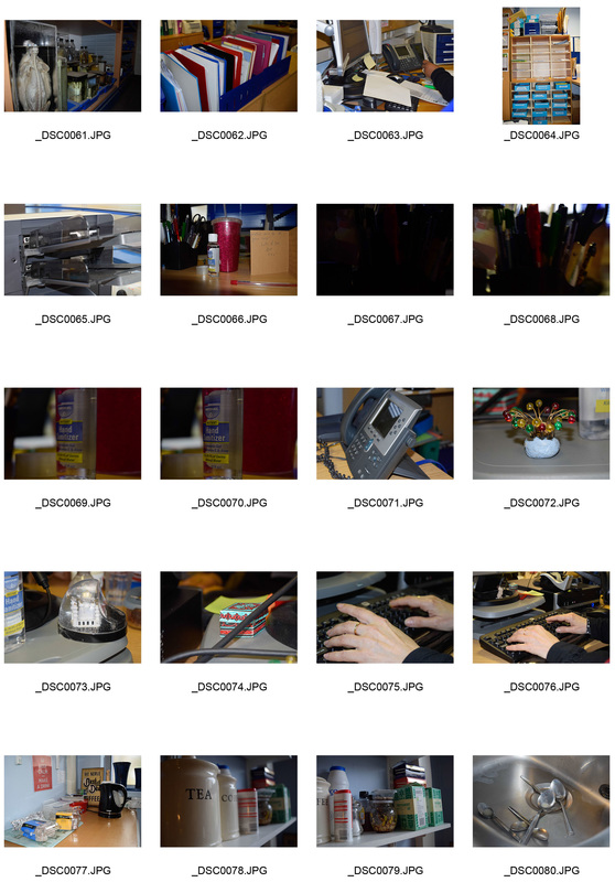
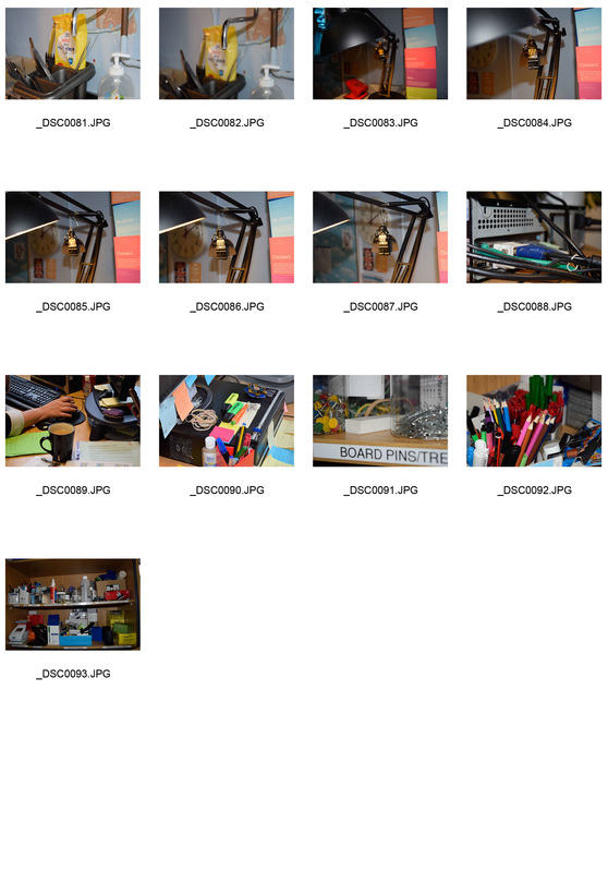
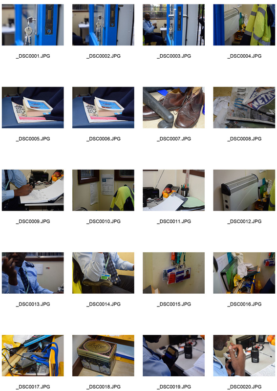
Lewis Khan second response
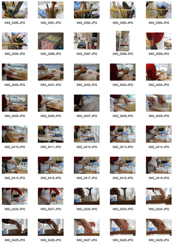
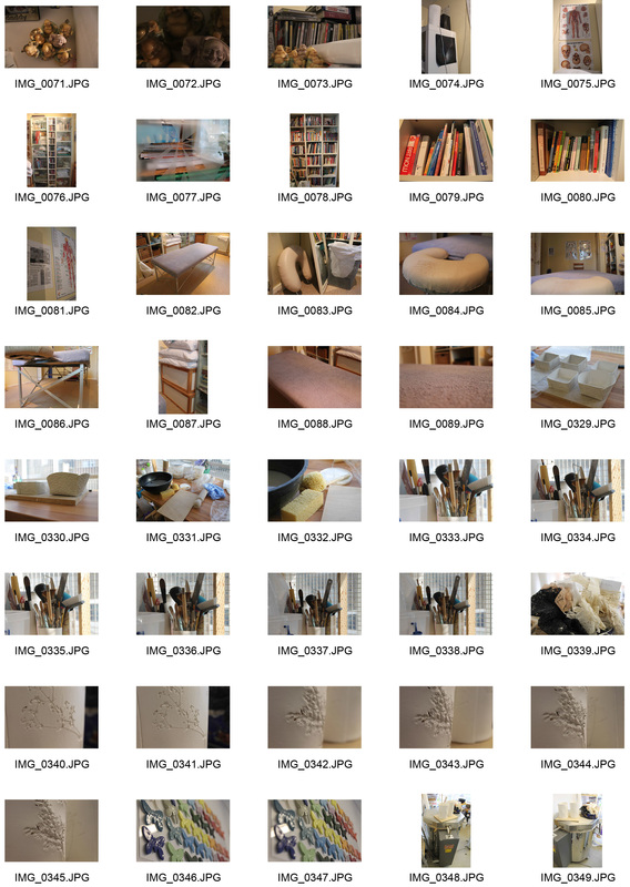
For my second response I looked at the work place of two different people one a rolfer and his work room and the other an artist studio that work with ceramics. When I went to photographer the places I kept this is mind like khan work I used lighting that the person who normally works there sees everyday. The only edits I did to the image was to turn it black and white so I would not disjoint the truth of how the object actually looks.
|
The Artist
|
The Rolfer
|

Three Strands
STRAND 1
|
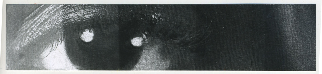
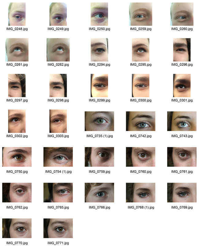
For my first strand I wanted to carry on with the work of Myra Green. However this time I only took close up of the person eye and left the colour of the eyeball normal. This is because I keep thinking of what Shakespeare said about ' a person eyes is the window to their soul'. This then got me thinking what could a person eye colour tell about them. I did some research on typical trades that a person has if they have a light colour eye or a dark eye colour from this article. Again I played with the idea of turning down the colour balance when you change the image to black and white on Photoshop. From these series I really like the fact that the model is still recognisable even if their skin is a different tone. When taking the photos I position the models eyes in the middle of image. I also made sure that I could see the person’s eyebrows and just below their eyes, as they are features that make a person recognisable.
|
|
STRAND 2
|
Final Edits
|
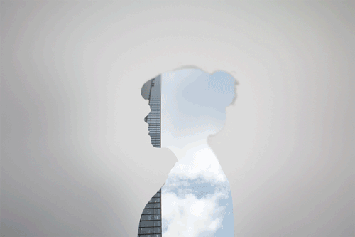
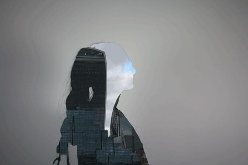
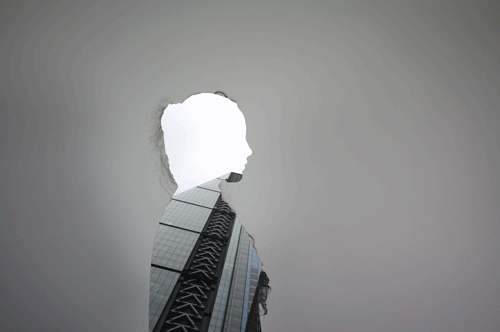
Inspired Artist: Jasper James
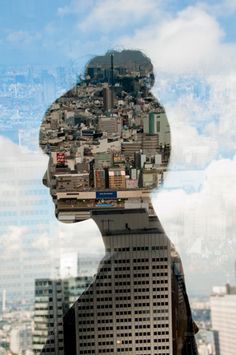
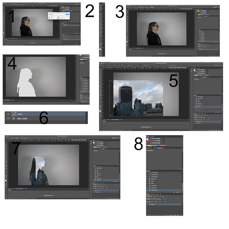
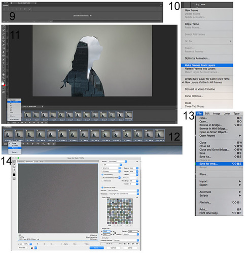
The image above is part of James’s city silhouettes. He got inspiration from the study in 2008 that shown that people living in rural areas outweighed people who lived in urban settings. He takes a photo of the city and locals. He makes a double exposer image by putting silhouettes of the people inside the city skyscrapers. He wanted to address the fact that the city has being getting so big that they are losing the individuality of the people that live there. I wanted to respond to his work. However instead of including the idea of losing individuality, I would do where the person underwent a change that stuck with them. For most of the people in my class they thought that there surrounding areas is where shaped them and other thought about the first family trip they remember. I also experimented with using a projector to project the image into people faces. I liked how its overlays with the person. However the projector made the colour balance of the photo strange and it did not show up in high definition. There was also a bright circle of light due to the light bouncing off the screen.
|
STRAND 3
|
Inspired artist: May Xiong
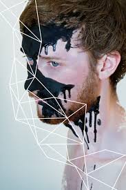
Here is an example of May Xiong’s work. She places the model in the right side of the image so it covers most of the image. She keeps the photo simplistic so by having a light background so attention is not drawn away from the model. She makes the model the focus as she makes the surrounding white to diffuse into blue. The black pain that is dripping from his face represents blood and pain. The theme of vulnerability is also shown by the fact that the model is nude and petite. The triangle pattern makes the image look more structured and contrasts with the paint.
I responded to May Xiong’s work. However I liked the concept of the triangle patterns. I chose to cover the whole of the person face instead of just a bit of it. I followed the structure of the face for example make a triangle for the nose and the eyes. I founded that using bigger triangles worked best, this is because if there was too many triangles the face would look disjointed and busy. |
|
FIRST DEVELOPMENT
|
Final Edits
|
Inspired Artist: Christoffer Relander
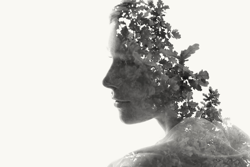
For my first development I carried on with strand 2 and the idea of double exposures. This time however I looked at Christoffer Relander work. He plays around with the relationship between man and nature in his series “we are nature”. what makes his work so impressive is that the texture of the leaves become the subject skin. The leaves makes it the image elegant and fragile.
|
SECOND DEVELOPMENT
|
|
Third Development
|
|
|
|


PROCESS
|
|
